So I was playing with IPython along with the holy trinity matplotlib, pandas, and numpy. I needed some data to really learn something here. It was March, 2016, and I was thinking, “Wow, it seems to be getting colder year after year in San Francisco! Sure don’t feel the Global Warming yet!” I didn’t have a whole year of data for 2016, so I went ahead and compared 2014 and 2015 temperatures for my Oakland zip code weather.
Came across a fairly good weather data related API online called http://forecast.io/. (IO is actually a top level domain name for British Indian Ocean Territory, but really cool concept for an API website.)
I had my data and did some analysis. Using 2 sample T-Test, it shows that there wasn’t a significant difference between the two years. Not a surprise from first hand experience as it’s always been around 40s degree to high 60s Farenheit. To really get an significant differences, the range of the weather would have to be wider, OR there is a big standard deviation from one month to another. Though my T-Test failed yielding a value of .57 P-Value with an alpha of 0.05, I was able to extrapolate from the graphs that between year 2014 and 2015, our weather temperatures aren’t warmer in general, but slightly more volatile. (Perhaps I should compare year 2015 to something like year 2000. Will save that for Part 2)
My conclusion from this quick analysis is that Global Warming is not making Bay Area warmer, but is making the weather more volatile – this is proven from looking at the Box Plot, Density Plot, and Scatter Plot.
If you’re using any of the code snippets, please do make a reference to this page!
In [1]:
#import forecastio
import arrow #A much mooooooore friendlier version than datetime package. I found my new datetime love!
import json
import datetime as dt
from progressbar import ProgressBar
import forecastio
import numpy as np

"""
Forecastio is a great website for grabbing weather data. For the free version, they're only allowing 1000 API calls per day.
But for every call, you'll grab 1 day of comprehensive data from all the aggregated sources that they're using - which is a lot.
Check out their website!
https://developer.forecast.io/
"""


api_key = '<removed>'
lati = '37.817773'
long = '-122.272232'

start = dt.datetime(2006,1,1)
end = dt.datetime(2008,1,1)

f_name="{0}--{1}-at-SanFran".format(end.date(),start.date(),lati=lati,long=long)

"""
pbar=ProgressBar()
with open(f_name+'.json', 'a+') as file:
    for c_date in pbar(arrow.Arrow.range('day', start, end)):
        fore = forecastio.load_forecast(api_key, lati, long,time=c_date)
        data=fore.json
        json.dump(data, file)
        file.write('\n')
        print c_date
"""
Out[1]:
"\npbar=ProgressBar()\nwith open(f_name+'.json', 'a+') as file:\n for c_date in pbar(arrow.Arrow.range('day', start, end)):\n fore = forecastio.load_forecast(api_key, lati, long,time=c_date)\n data=fore.json\n json.dump(data, file)\n file.write('\n')\n print c_date\n"In [2]:
##### import pandas as pd
import pandas as pd


'''
print pd.DatetimeIndex(pd.to_datetime(csv['sunriseTime'],unit='s',utc=True),tz=timezone('UTC')) #--timezone output are all in UTC, need to convert later
#Probably would need to do something like the following
import datetime as dt
import pytz
time_now =  dt.datetime.utcnow()  #if inputting POSIX unix epoch time, use utcfromtimestamp() function
pacific_time=pytz.timezone('America/Los_Angeles')
with_utc = time_now.replace(tzinfo=pytz.utc)
with_pacific = with_utc.astimezone(pacific_time)
'''
daily_df=pd.DataFrame()
with open('weather_2014-01-01---2016-01-01.json','rb') as f:
    lines=f.readlines()
    for line in lines:
        try:
            json = pd.read_json(line)['daily']['data'][0]
            #You can get the column names by json.keys()
            df=pd.DataFrame(json,index=(pd.to_datetime(json['sunriseTime'],unit='s'),),
                            columns=[u'summary', u'sunriseTime', u'apparentTemperatureMinTime', u'moonPhase', u'icon', u'precipType',
                                   u'apparentTemperatureMax', u'temperatureMax', u'time', u'apparentTemperatureMaxTime', u'sunsetTime',
                                   u'pressure', u'windSpeed', u'temperatureMin', u'apparentTemperatureMin', u'windBearing', u'temperatureMaxTime',
                                   u'temperatureMinTime'])
            daily_df=daily_df.append(df)
        except KeyError:
            pass
            #Finished Appending

daily_df['averageTemperature']=(daily_df['temperatureMax']+daily_df['temperatureMin'])/2  #Creating average Temperature dynamically
In [3]:
#Now finally for some real fun
df_2015=daily_df['2015']['averageTemperature'].copy()
df_2014=daily_df['2014']['averageTemperature'].copy()

"""
#Notice I'm doing something extremely interesting here.
The problem is that I'm trying to compare year 2014 and year 2015 with the same day on the same graph, but datetime don't have
this logic of removing the year from the date. So I created a new index starting year 2015-01-01 till the end and put them on the same index
Next, I tried to hide the year from the graph. A very Hacky way to do this, but works fine.
"""


new_index=pd.date_range('2015-01-01', periods=365, freq='D')
new_df=pd.DataFrame({'Year 2014':df_2014.values, 'Year 2015':df_2015.values},index=new_index)


#Create a new column of Strings categorizing each row by months
def month_cat(num):
    num=int(num)
    if num==1: return 'Jan'
    if num==2: return 'Feb'
    if num==3: return 'Mar'
    if num==4: return 'Apr'
    if num==5: return 'May'
    if num==6: return 'Jun'
    if num==7: return 'Jul'
    if num==8: return 'Aug'
    if num==9: return 'Sep'
    if num==10: return 'Oct'
    if num==11: return 'Nov'
    if num==12: return 'Dec'

#new_df.drop('month_category', axis=1, inplace=True)
cat_list=list()
for i in new_df.index.month:
    cat_list.append(month_cat(i))
new_df['month_category']=cat_list


import datetime
import matplotlib.pyplot as plt

%matplotlib inline
plt.style.use('ggplot')

from IPython.core.display import HTML
HTML("<style>.container { width:100% !important; }</style>") #Makes the graphs fitting window size of the browser.
Out[3]: In [4]:
print "Time to look at the basic statistics of our data"
print new_df[['Year 2014', 'Year 2015']].describe()

print "-"*100
print "I was expecting both to have count as 365. Looks like might have some NAN values. The next thing I'm going to try to do is fill each NAN with the average temperature it is grouped in per month"

nan_index= pd.isnull(new_df[['Year 2015']]).any(1).nonzero()[0]
#print nan_index #[ 50  51 156 239 240 308 310 337 338]
print new_df.iloc[nan_index]

print "-"*100
print "I might find a more pythonic way to do this in the future, but right now I'm jus going to calculate every month's average and fill the NAN row in the associated month."
print "-"*100
print "Before conversion"
print new_df['Year 2015'].iloc[nan_index]

month_avg_2015={}
for month in new_df.groupby('month_category').groups.keys():
    month_avg_2015[month]=new_df.groupby('month_category')['Year 2015'].get_group(month).mean()


for nans in nan_index:
    new_df['Year 2015'].iloc[nans]=month_avg_2015[new_df['month_category'].iloc[nans]]

print "-"*100
print "After conversion"
print new_df['Year 2015'].iloc[nan_index]
Time to look at the basic statistics of our data
        Year 2014  Year 2015
count     365.000        356
unique    337.000        335
top        59.705         56
freq        3.000          2
----------------------------------------------------------------------------------------------------
I was expecting both to have count as 365. Looks like might have some NAN values. The next thing I'm going to try to do is fill each NAN with the average temperature it is grouped in per month
           Year 2014 Year 2015 month_category
2015-02-20     56.56       NaN            Feb
2015-02-21     57.13       NaN            Feb
2015-06-06    57.755       NaN            Jun
2015-08-28    64.115       NaN            Aug
2015-08-29    62.925       NaN            Aug
2015-11-05    64.965       NaN            Nov
2015-11-07     61.01       NaN            Nov
2015-12-04     60.72       NaN            Dec
2015-12-05    60.555       NaN            Dec
----------------------------------------------------------------------------------------------------
I might find a more pythonic way to do this in the future, but right now I'm jus going to calculate every month's average and fill the NAN row in the associated month.
----------------------------------------------------------------------------------------------------
Before conversion
2015-02-20    NaN
2015-02-21    NaN
2015-06-06    NaN
2015-08-28    NaN
2015-08-29    NaN
2015-11-05    NaN
2015-11-07    NaN
2015-12-04    NaN
2015-12-05    NaN
Name: Year 2015, dtype: object
----------------------------------------------------------------------------------------------------
After conversion
2015-02-20    58.53519
2015-02-21    58.53519
2015-06-06    60.96034
2015-08-28    66.01207
2015-08-29    66.01207
2015-11-05    56.00054
2015-11-07    56.00054
2015-12-04      51.275
2015-12-05      51.275
Name: Year 2015, dtype: object
In [5]:
print new_df.describe() #Data looks a lot better now. Finally going into some plotting.
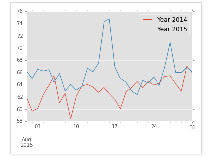
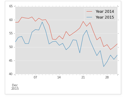
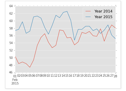
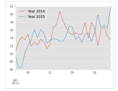
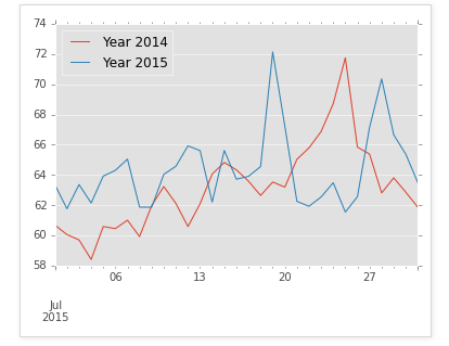
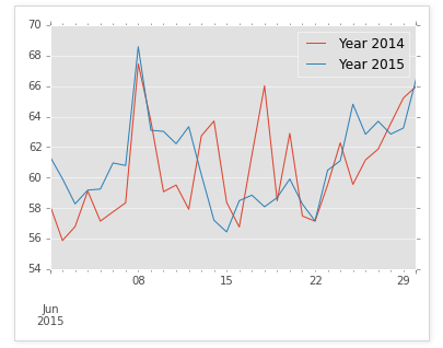
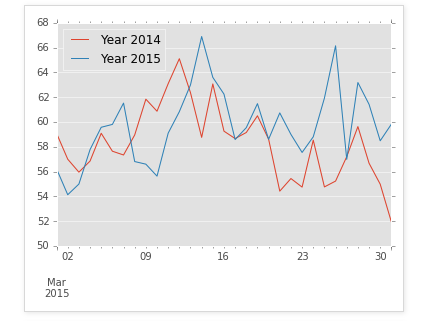
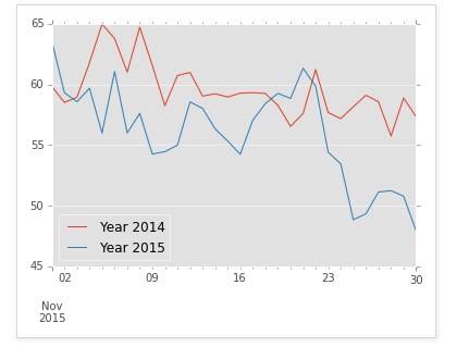
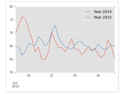
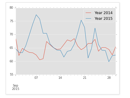
line_plot = new_df.plot(kind='line',figsize =(30,10),title="Year 2014 and 2015 Temperatures",lw=2,fontsize=15)
line_plot.set_xlabel("Months(Disregard Jan 2015, don't know how to get rid of it)")
line_plot.set_ylabel("Farenheit")
"""
Can't tell much different from the simple line plot.
"""
        Year 2014  Year 2015 month_category
count     365.000        365            365
unique    337.000        340             12
top        59.705         56            Jul
freq        3.000          2             31
Out[5]:
"\nCan't tell much different from the simple line plot. \n"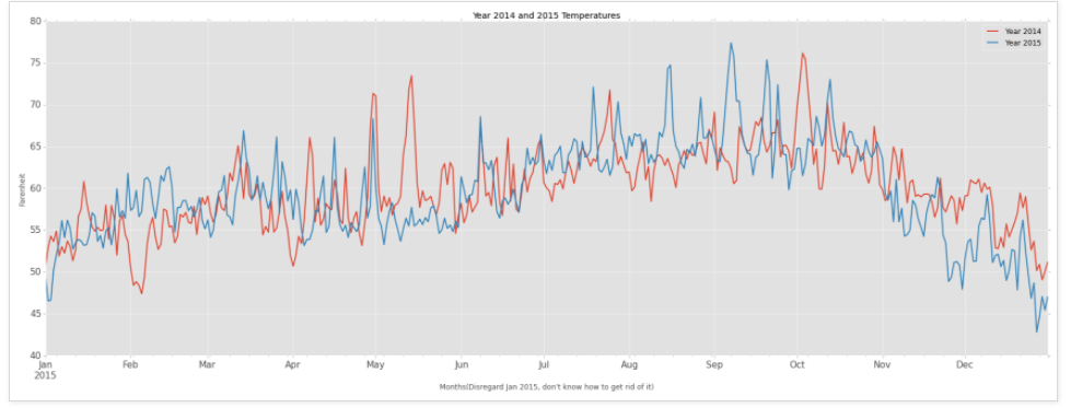
In [6]:
line_plot = new_df.plot(kind='density',figsize =(30,10),title="Year 2014 and 2015 Temperatures", lw=3.0, fontsize=20)
"""
Density plot shows in Year 2014, the temperature seemed a bit more mild and stable in comparison to Year 2015 which had a wider spread.
"""
Out[6]:
'\nDensity plot shows in Year 2014, the temperature seemed a bit more mild and stable in comparison to Year 2015 which had a wider spread. \n'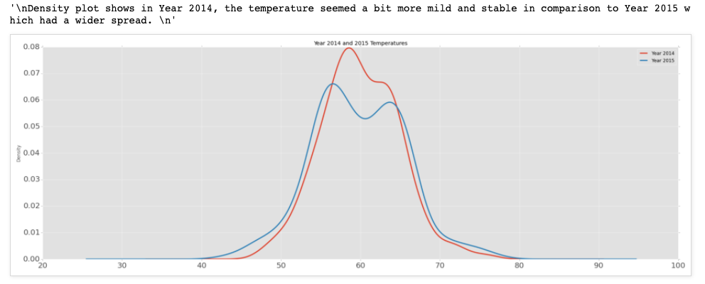
In [7]:
new_df.plot(kind='box',figsize =(8,10),title="Year 2014 and 2015 Temperatures")
'''
The Box plot also confirms this.
'''
Out[7]:
'The Box plot also confirms this.'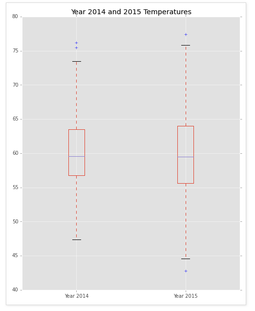
In [8]:
plotting = grouped.plot()

#axis=0 along the row
#axis=1 along the column
#http://stackoverflow.com/questions/26886653/pandas-create-new-column-based-on-values-from-other-columns quite useful save for later

In [9]:
print new_df.plot(kind='scatter', x='Year 2014', y='Year 2015', figsize=(10,10)) #Scatter plot


'''
Scatter plot looks like there is a moderate positive relationship between the two years. There's a lot of clusters in the middle whereas higher temperatures had more extreme outliers.
'''

Axes(0.125,0.125;0.775x0.775)
Out[9]:
"\nScatter plot looks like there is a moderate positive relationship between the two years. There's a lot of clusters in the middle whereas higher temperatures had more extreme outliers. \n"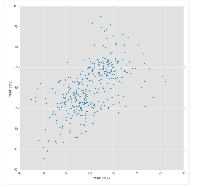
In [10]:
print "T-Statistic is: {0} and P-Value is: {1}".format(t_stat,two_tail_p_value)

"""
With my alpha of 0.05, and I received a P-Value of 0.577, I have failed to prove that there is a significant difference of mean between Year 2014 Temperature and Year 2015.
Though from the graphs, we can say that Year 2014 seemed to have smaller spread of temperature - a much more stable year than 2015.
"""
T-Statistic is: 0.557834629664 and P-Value is: 0.577133796932
Out[10]:
'With my alpha of 0.05, and I received a P-Value of 0.577, I have failed to prove that there is a significant difference of mean between Year 2014 Temperature and Year 2015. \nThough from the graphs, we can say that Year 2014 seemed to have smaller spread of temperature - a much more stable year than 2015. '
Leave a comment