Oakland Weather Pattern with T-Stats.
This is part II of my previous posting regarding Oakland’s weird weather despite Global Warming. You can go ahead and read what I’ve written there (which is a jumble of IPython Notebook code that I can no longer change because Blogger is acting weird. If you’ve seen it already skip the following paragraph and move to the next one.)
To sum it up, this analysis began because I’ve been living in the Oakland area for two years and five months and haven’t felt the weather was getting warmer year after despite the amount of severity I’ve been hearing about Global Warming and how the average temperature has been climbing 1.4 Fahrenheit every year. Yes, I understand that some geographical locations might be differently , but based on the description national geographic description, I thought maybe Oakland’s weather could have been warmer. So I got my hands on some weather data and began comparing years 2014 and 2015. From T-Test Statistics, it looks like there wasn’t a significant difference with alpha of 0.05. The T-Test just says that I could be complaining about the cold too much and the two years were actually very similar in terms of means. I also concluded that Global Warming is not making Oakland’s weather warmer, but more volatile. At the time I only had Year 2014 and Year 2015 data, and based on some graphs I created, that was the conclusion I made.
In this post, I prepared an average temperature weather data from years 2000-2015. First I need to take the statement back about Global Warming was making bay area’s weather volatile as concluded in Part I. In fact, I think we should take out the whole Global Warming contribution factor and reassess the current state of our Oakland weather pattern. There’s a need to establish a base expectations before comparing other factors. My box plot below already disproves that global warming is making the weather more volatile over the years because there isn’t any kind of observable pattern. If volatility increased over years, then the whiskers for recent years should be longer, but as shown this is not the case. Year 2008 actually seems more volatile then Year 2000 and 2015. As far as box-plot goes, Oakland weather is still mostly in the mid 50s to mid 60s Fahrenheit every year.

In this post, my research question is, “Is Oakland’s Weather Getting Warmer Over the Years?” Why am I asking this question? I’ve been looking at various articles online published by well known resources that part of the characteristics of Global Warming is the exponential rate increase of temperature. Over the next decade Temperature will rise 2.5%-10% due to the amount of human caused C02 emissions into the atmosphere. I’m not disagreeing with the information provided by the IPCC or the National Geographics. But it would make me feel more comfortable if it mentioned how the extra water Earth is getting from the polar parts of the world would buffer these effects. Water absorbs heat and C02 really well after all. (This might be a potential topic in the upcoming posts.)
My null hypothesis is in the recent years, there is no significant differences of recent Oakland Weather Temperatures against its past.
My my alternative Hypothesis is… there is.
Alpha = 0.05
Below is the T-Stat and two tail P-value for Year 2000 and Year 2015.
Note that I am skipping through the calculation details very quickly as I’m using Python libraries to do the computation. There will be a link below showing my notebook.
Year 2000 and Year 2015: T_Statistics:2.46825543862 P-Value:0.0138134155695
T-Stat already says there’s a significance difference.
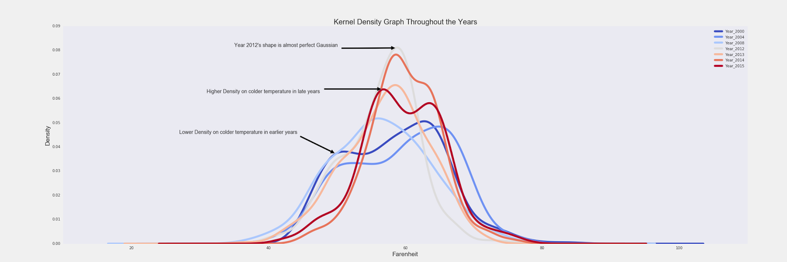
Let’s look at the Kernel Density Estimation Graph for this.
(It’s almost like Histogram graphs, except they’re smoothed out looking more like mountains than rectangles. They’re created by estimating between one data point to the next one. It can be effective when there’s a lot of data which solves outlier issues. And yes, there is an actual formula for it. https://en.wikipedia.org/wiki/Kernel_density_estimation)
Plus an url evaluating Histogram vs KDE

From the graph, it would appear year 2015 had a warmer year because there were a lot more concentration shifted to the right and the model is a lot skinnier. We’re working on a complicated question and just using the two years wouldn’t justify any kind of conclusion. So I went ahead and plotted the KDE for several more years that were significant. Then I discovered something interesting relative to the shapes of various years.
To view the KDE over 15 years individually, it is available here.
A quick examination of the KDE shapes, it seems to be transforming in a predictable pattern. In Year 2000, it looks like an uneven camel hump shape with more warmer temperatures density concentration. In 2008, it looks almost like a perfect normal model. In the late years, the uneven camel hump came back again, but this time more concentration on the colder side of the temperatures. Following this pattern, it may seem that the prediction for year 2016, the camel hump will be present and perhaps the model will be slightly more spread out as supposed to 2015. To me, this graph does says average temperature possibly is rising since the model in later years are skinnier and shifted more to the right. But within a year, there’s more days that might felt colder than days that are warmer. (More days in the low 50s degrees then days in the high 60s degrees Fahrenheit.) This supports the overall resources I’ve been reading and the first hand experience living in Oakland.
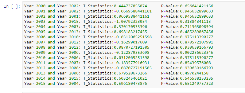
The next thing I’m trying to figure out is, “If I’m in Year 2000, how many years do I need to wait to experience the temperature differences?” To get the answer of this problem, basically I compared a given base year against every other years using the same T-Test.
Summing up the results, it varies. For a given year, I might be able to feel the differences next year, or a couple years after. I’m disappointed to say, there’s no trend. Or rather, my data is too simple because I’m just using average temperatures.
Let’s turn our head to the other side and ask, “For a given base year, are the years before and after similar enough?” Answer is “maybe”. Below are the highest P-Values for a given base year. Sometimes it hit the mark, sometimes it doesn’t. Year 2006 and Year 2010 supposedly have a P-Value of 97.5%.
I think that’s enough T-Statistics for one post. Next, I’ll use a different kind!
Some other things to consider in the next post:
- Use more dimensions of data. Ex: percipitation, humidity, pressure, sun rise and sun down time
- Calculating draught in California
- Anova, Manova, Regression?
Please leave some comments! Harsh criticisms are welcomed.
Data provided by http://www.forecast.io
My Notebook. Specific data used will not be provided as it is owned by forecast.io. You can download them yourselves!
Citations:
Intergovernmental Climate Change. “The Consequences of Climate Change.” Http://climate.nasa.gov/effects/. NASA, n.d. Web. 10 Apr. 2016.
National Geographic News. “Global Warming Fast Facts.” National Geographic. National Geographic Society, 14 June 2007. Web. 10 Apr. 2016
“Rising Temperatures.” Rising Temperatures. Http://wwf.panda.org/about_our_earth/aboutcc/problems/rising_temperatures/, n.d. Web. 10 Apr. 2016.

Leave a comment